Chapter 5 Data visualisation with R
Let’s first introduce the data set that will be used throughout this chapter. The data set, ames is a part of the Ames Housing Price data, containing 165 observations and 12 features including the sale date and price.
library(RBootcamp)
str(ames)
## 'data.frame': 2930 obs. of 81 variables:
## $ MS_SubClass : Factor w/ 16 levels "One_Story_1946_and_Newer_All_Styles",..: 1 1 1 1 6 6 12 12 12 6 ...
## $ MS_Zoning : Factor w/ 7 levels "Floating_Village_Residential",..: 3 2 3 3 3 3 3 3 3 3 ...
## $ Lot_Frontage : num 141 80 81 93 74 78 41 43 39 60 ...
## $ Lot_Area : int 31770 11622 14267 11160 13830 9978 4920 5005 5389 7500 ...
## $ Street : Factor w/ 2 levels "Grvl","Pave": 2 2 2 2 2 2 2 2 2 2 ...
## $ Alley : Factor w/ 3 levels "Gravel","No_Alley_Access",..: 2 2 2 2 2 2 2 2 2 2 ...
## $ Lot_Shape : Factor w/ 4 levels "Regular","Slightly_Irregular",..: 2 1 2 1 2 2 1 2 2 1 ...
## $ Land_Contour : Factor w/ 4 levels "Bnk","HLS","Low",..: 4 4 4 4 4 4 4 2 4 4 ...
## $ Utilities : Factor w/ 3 levels "AllPub","NoSeWa",..: 1 1 1 1 1 1 1 1 1 1 ...
## $ Lot_Config : Factor w/ 5 levels "Corner","CulDSac",..: 1 5 1 1 5 5 5 5 5 5 ...
## $ Land_Slope : Factor w/ 3 levels "Gtl","Mod","Sev": 1 1 1 1 1 1 1 1 1 1 ...
## $ Neighborhood : Factor w/ 29 levels "North_Ames","College_Creek",..: 1 1 1 1 7 7 17 17 17 7 ...
## $ Condition_1 : Factor w/ 9 levels "Artery","Feedr",..: 3 2 3 3 3 3 3 3 3 3 ...
## $ Condition_2 : Factor w/ 8 levels "Artery","Feedr",..: 3 3 3 3 3 3 3 3 3 3 ...
## $ Bldg_Type : Factor w/ 5 levels "OneFam","TwoFmCon",..: 1 1 1 1 1 1 5 5 5 1 ...
## $ House_Style : Factor w/ 8 levels "One_and_Half_Fin",..: 3 3 3 3 8 8 3 3 3 8 ...
## $ Overall_Qual : Factor w/ 10 levels "Very_Poor","Poor",..: 6 5 6 7 5 6 8 8 8 7 ...
## $ Overall_Cond : Factor w/ 10 levels "Very_Poor","Poor",..: 5 6 6 5 5 6 5 5 5 5 ...
## $ Year_Built : int 1960 1961 1958 1968 1997 1998 2001 1992 1995 1999 ...
## $ Year_Remod_Add : int 1960 1961 1958 1968 1998 1998 2001 1992 1996 1999 ...
## $ Roof_Style : Factor w/ 6 levels "Flat","Gable",..: 4 2 4 4 2 2 2 2 2 2 ...
## $ Roof_Matl : Factor w/ 8 levels "ClyTile","CompShg",..: 2 2 2 2 2 2 2 2 2 2 ...
## $ Exterior_1st : Factor w/ 16 levels "AsbShng","AsphShn",..: 4 14 15 4 14 14 6 7 6 14 ...
## $ Exterior_2nd : Factor w/ 17 levels "AsbShng","AsphShn",..: 11 15 16 4 15 15 6 7 6 15 ...
## $ Mas_Vnr_Type : Factor w/ 5 levels "BrkCmn","BrkFace",..: 5 4 2 4 4 2 4 4 4 4 ...
## $ Mas_Vnr_Area : num 112 0 108 0 0 20 0 0 0 0 ...
## $ Exter_Qual : Factor w/ 4 levels "Excellent","Fair",..: 4 4 4 3 4 4 3 3 3 4 ...
## $ Exter_Cond : Factor w/ 5 levels "Excellent","Fair",..: 5 5 5 5 5 5 5 5 5 5 ...
## $ Foundation : Factor w/ 6 levels "BrkTil","CBlock",..: 2 2 2 2 3 3 3 3 3 3 ...
## $ Bsmt_Qual : Factor w/ 6 levels "Excellent","Fair",..: 6 6 6 6 3 6 3 3 3 6 ...
## $ Bsmt_Cond : Factor w/ 6 levels "Excellent","Fair",..: 3 6 6 6 6 6 6 6 6 6 ...
## $ Bsmt_Exposure : Factor w/ 5 levels "Av","Gd","Mn",..: 2 4 4 4 4 4 3 4 4 4 ...
## $ BsmtFin_Type_1 : Factor w/ 7 levels "ALQ","BLQ","GLQ",..: 2 6 1 1 3 3 3 1 3 7 ...
## $ BsmtFin_SF_1 : num 2 6 1 1 3 3 3 1 3 7 ...
## $ BsmtFin_Type_2 : Factor w/ 7 levels "ALQ","BLQ","GLQ",..: 7 4 7 7 7 7 7 7 7 7 ...
## $ BsmtFin_SF_2 : num 0 144 0 0 0 0 0 0 0 0 ...
## $ Bsmt_Unf_SF : num 441 270 406 1045 137 ...
## $ Total_Bsmt_SF : num 1080 882 1329 2110 928 ...
## $ Heating : Factor w/ 6 levels "Floor","GasA",..: 2 2 2 2 2 2 2 2 2 2 ...
## $ Heating_QC : Factor w/ 5 levels "Excellent","Fair",..: 2 5 5 1 3 1 1 1 1 3 ...
## $ Central_Air : Factor w/ 2 levels "N","Y": 2 2 2 2 2 2 2 2 2 2 ...
## $ Electrical : Factor w/ 6 levels "FuseA","FuseF",..: 5 5 5 5 5 5 5 5 5 5 ...
## $ First_Flr_SF : int 1656 896 1329 2110 928 926 1338 1280 1616 1028 ...
## $ Second_Flr_SF : int 0 0 0 0 701 678 0 0 0 776 ...
## $ Low_Qual_Fin_SF : int 0 0 0 0 0 0 0 0 0 0 ...
## $ Gr_Liv_Area : int 1656 896 1329 2110 1629 1604 1338 1280 1616 1804 ...
## $ Bsmt_Full_Bath : num 1 0 0 1 0 0 1 0 1 0 ...
## $ Bsmt_Half_Bath : num 0 0 0 0 0 0 0 0 0 0 ...
## $ Full_Bath : int 1 1 1 2 2 2 2 2 2 2 ...
## $ Half_Bath : int 0 0 1 1 1 1 0 0 0 1 ...
## $ Bedroom_AbvGr : int 3 2 3 3 3 3 2 2 2 3 ...
## $ Kitchen_AbvGr : int 1 1 1 1 1 1 1 1 1 1 ...
## $ Kitchen_Qual : Factor w/ 5 levels "Excellent","Fair",..: 5 5 3 1 5 3 3 3 3 3 ...
## $ TotRms_AbvGrd : int 7 5 6 8 6 7 6 5 5 7 ...
## $ Functional : Factor w/ 8 levels "Maj1","Maj2",..: 8 8 8 8 8 8 8 8 8 8 ...
## $ Fireplaces : int 2 0 0 2 1 1 0 0 1 1 ...
## $ Fireplace_Qu : Factor w/ 6 levels "Excellent","Fair",..: 3 4 4 6 6 3 4 4 6 6 ...
## $ Garage_Type : Factor w/ 7 levels "Attchd","Basment",..: 1 1 1 1 1 1 1 1 1 1 ...
## $ Garage_Finish : Factor w/ 4 levels "Fin","No_Garage",..: 1 4 4 1 1 1 1 3 3 1 ...
## $ Garage_Cars : num 2 1 1 2 2 2 2 2 2 2 ...
## $ Garage_Area : num 528 730 312 522 482 470 582 506 608 442 ...
## $ Garage_Qual : Factor w/ 6 levels "Excellent","Fair",..: 6 6 6 6 6 6 6 6 6 6 ...
## $ Garage_Cond : Factor w/ 6 levels "Excellent","Fair",..: 6 6 6 6 6 6 6 6 6 6 ...
## $ Paved_Drive : Factor w/ 3 levels "Dirt_Gravel",..: 2 3 3 3 3 3 3 3 3 3 ...
## $ Wood_Deck_SF : int 210 140 393 0 212 360 0 0 237 140 ...
## $ Open_Porch_SF : int 62 0 36 0 34 36 0 82 152 60 ...
## $ Enclosed_Porch : int 0 0 0 0 0 0 170 0 0 0 ...
## $ Three_season_porch: int 0 0 0 0 0 0 0 0 0 0 ...
## $ Screen_Porch : int 0 120 0 0 0 0 0 144 0 0 ...
## $ Pool_Area : int 0 0 0 0 0 0 0 0 0 0 ...
## $ Pool_QC : Factor w/ 5 levels "Excellent","Fair",..: 4 4 4 4 4 4 4 4 4 4 ...
## $ Fence : Factor w/ 5 levels "Good_Privacy",..: 5 3 5 5 3 5 5 5 5 5 ...
## $ Misc_Feature : Factor w/ 6 levels "Elev","Gar2",..: 3 3 2 3 3 3 3 3 3 3 ...
## $ Misc_Val : int 0 0 12500 0 0 0 0 0 0 0 ...
## $ Mo_Sold : int 5 6 6 4 3 6 4 1 3 6 ...
## $ Year_Sold : int 2010 2010 2010 2010 2010 2010 2010 2010 2010 2010 ...
## $ Sale_Type : Factor w/ 10 levels "COD","Con","ConLD",..: 10 10 10 10 10 10 10 10 10 10 ...
## $ Sale_Condition : Factor w/ 6 levels "Abnorml","AdjLand",..: 5 5 5 5 5 5 5 5 5 5 ...
## $ Sale_Price : int 215000 105000 172000 244000 189900 195500 213500 191500 236500 189000 ...
## $ Longitude : num -93.6 -93.6 -93.6 -93.6 -93.6 ...
## $ Latitude : num 42.1 42.1 42.1 42.1 42.1 ...5.1 Scatterplots
Are the bigger houses more expensive? In base R, we can use the plot() function to generate this scatterplot with the first argument being the variable on the x-axis and the second argument being the variable on the y-axis.
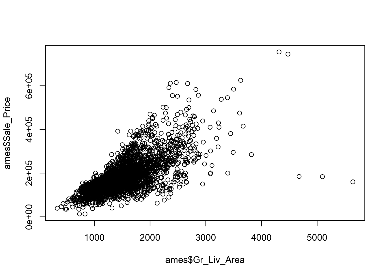
It’s OK but not nice. The plot() function provides a rich capability of customization by setting the graphical parameters.
plot(ames$Gr_Liv_Area, ames$Sale_Price,
     col = "red",
     xlab = "Living Area",
     ylab = "Sale Price",
     main = "Sale Price vs. Living Area",
     pch = 1, #Shape of the points
     cex = 1) #Size of text and symbols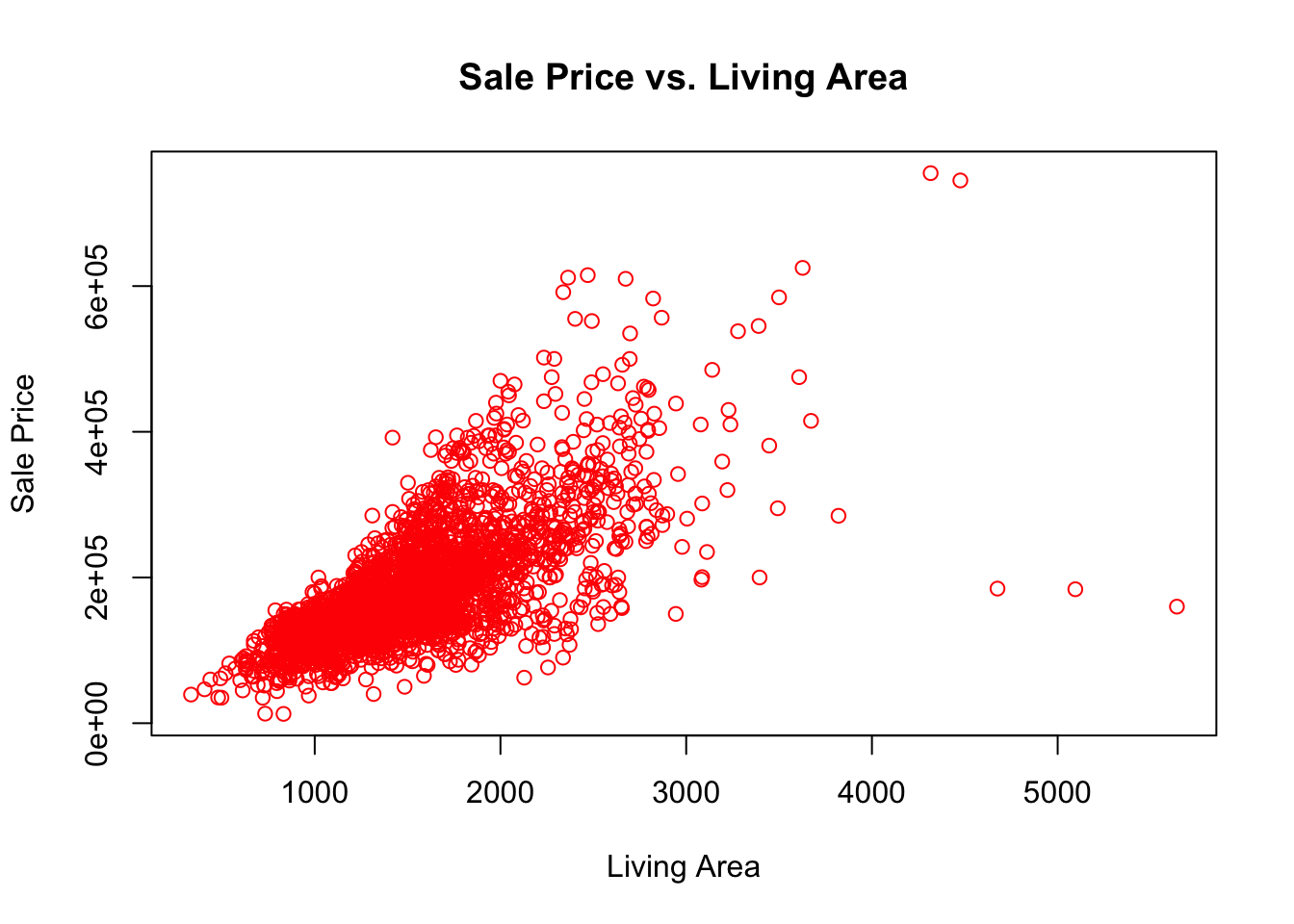
Although the plot() function gets the work done, the ggplot2 package provides a superior user experience. It’s a member of the tidyverse package, you don’t need to install it separately if tidyverse was already installed.
library(ggplot2)
ggplot(data = ames) +
  geom_point(mapping = aes(x = Gr_Liv_Area, y = Sale_Price))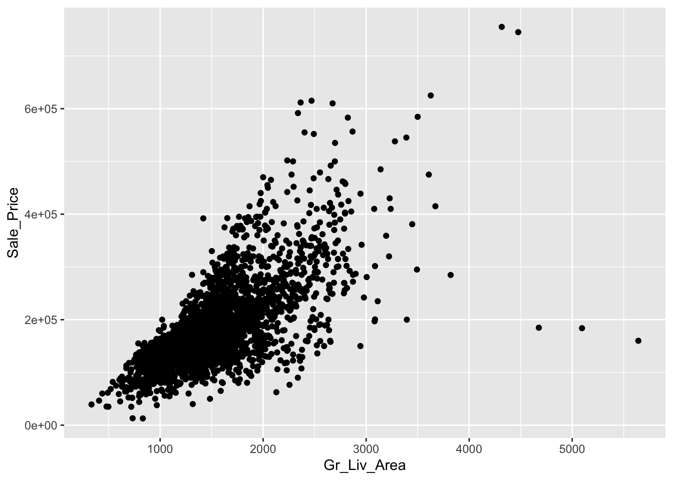
In a nutshell, ggplot2 implements the grammar of graphics, a coherent system for describing and building graphs. We always start with the function ggplot() with a data frame or tibble as its argument. To generate a scatterplot, you can add a layer using the + operator followed by the geom_point() function, which is one of the many available geoms in ggplot. Inside geom_point(), you need to set the value of the mapping argument. The mapping argument takes a functional form as mapping = aes(), where the aes is short for aesthetics. For example, you can use aes() to tell ggplot to use which variable on the x-axis, which variable on the y-axis.
ggplot(data = ames) +
  geom_point(mapping = aes(Gr_Liv_Area, y = Sale_Price),
             color = "red",
             shape = 2,
             size = 0.5,
             alpha = 0.3) #transparency level of the points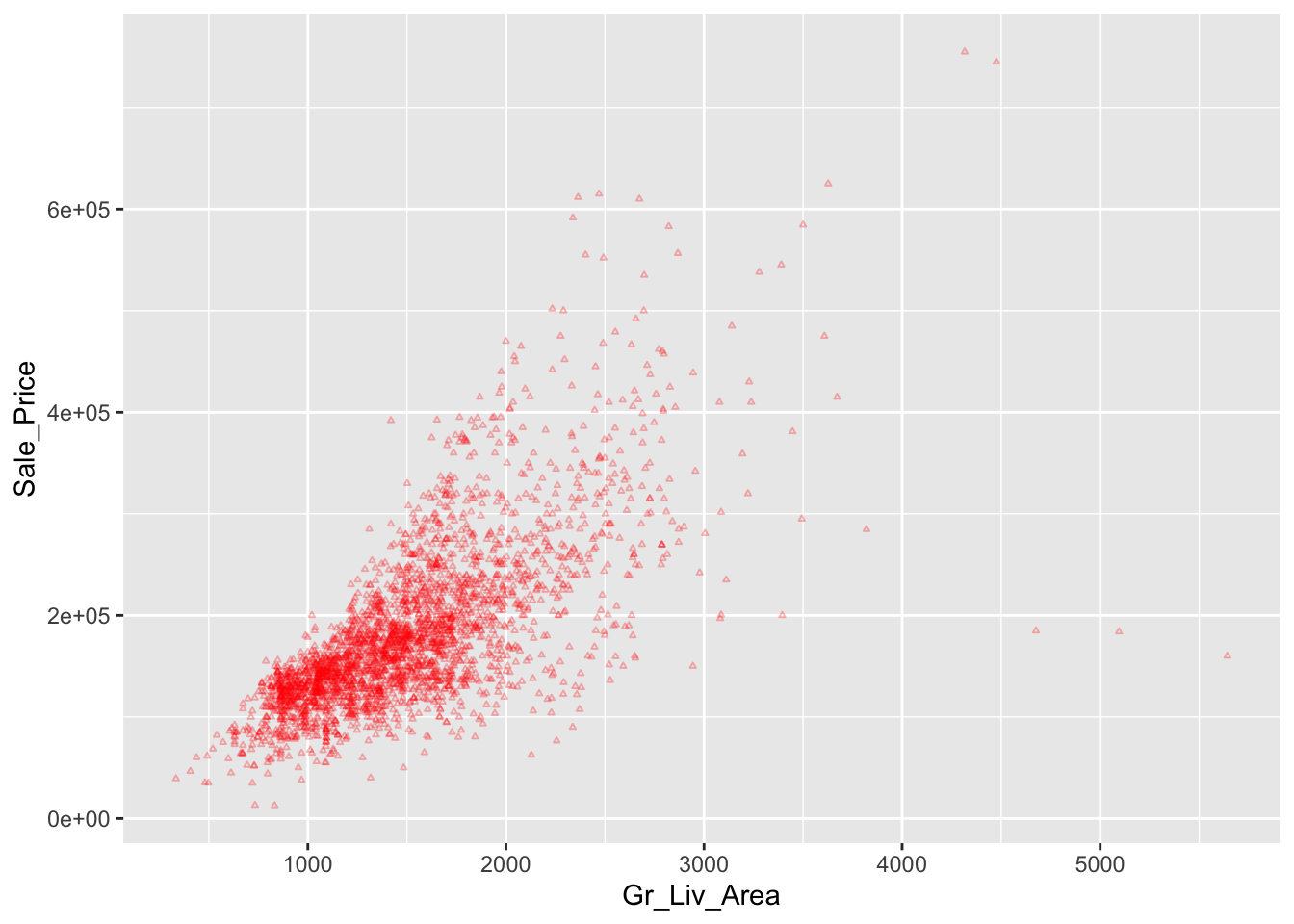
Suppose we want to use different colors according to the different House_Style in the scatterplot.
ggplot(data = ames) +
  geom_point(mapping = aes(x = Gr_Liv_Area,
                           y = Sale_Price,
                           color = House_Style),
             size = 1)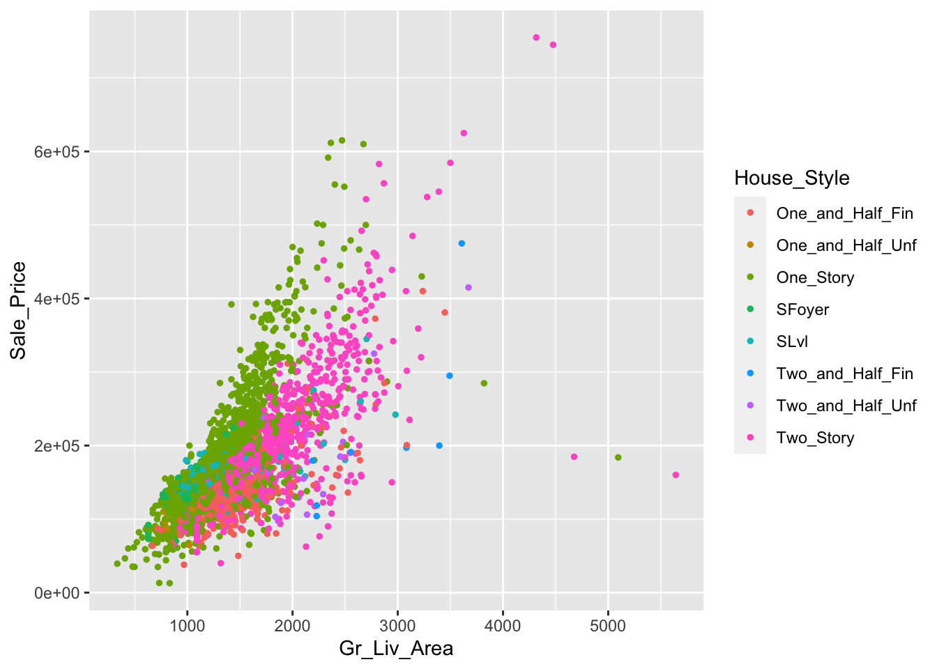
In addition to color, you can also map a discrete variable to the size aesthetic.
ggplot(data = ames) +
  geom_point(mapping = aes(x = Gr_Liv_Area,
                           y = Sale_Price,
                           size = House_Style),
             alpha = 0.5)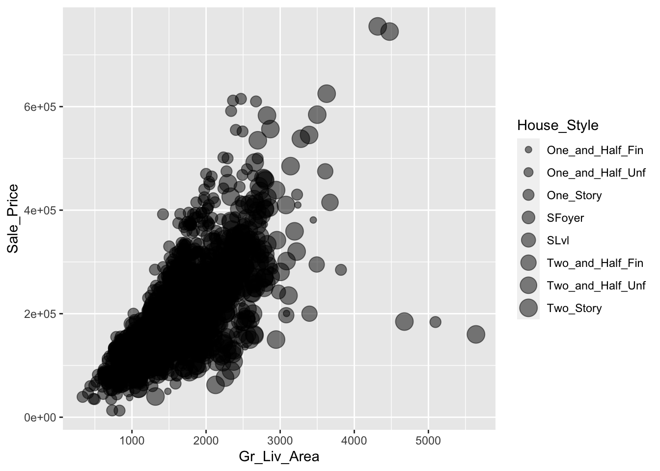
Or
ggplot(data = ames) +
  geom_point(mapping = aes(x = Gr_Liv_Area,
                           y = Sale_Price,
                           shape = Exter_Qual),
             alpha = 0.5,
             size = 2)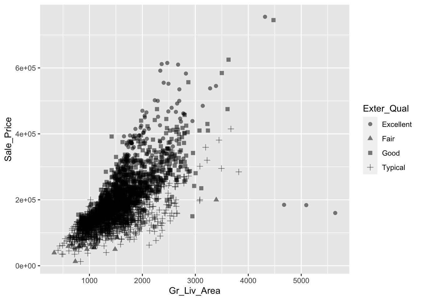
and multiple mapping:
ggplot(data = ames) +
  geom_point(mapping = aes(x = Gr_Liv_Area,
                           y = Sale_Price,
                           shape = Exter_Qual,
                           color = Central_Air),
             alpha = 0.5,
             size = 2)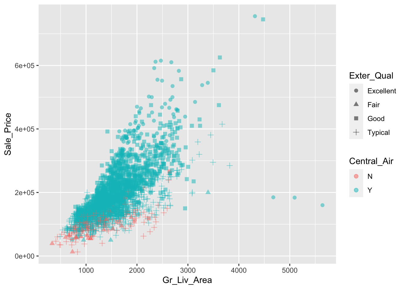
5.2 Smootlines
ggplot(data = ames) +
  geom_smooth(mapping = aes(x = Gr_Liv_Area,
                           y = Sale_Price),
              size = 1.5)
## `geom_smooth()` using method = 'gam' and formula 'y ~ s(x, bs = "cs")'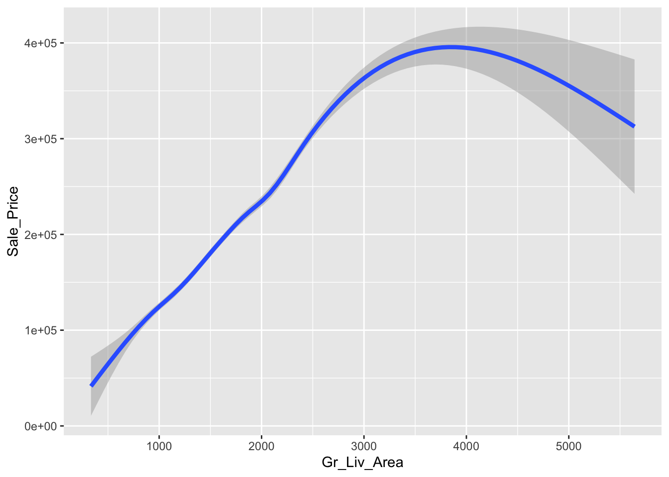
ggplot(data = ames) +
  geom_smooth(mapping = aes(x = Gr_Liv_Area,
                           y = Sale_Price),
              size = 1.5,
              method = "lm")
## `geom_smooth()` using formula 'y ~ x'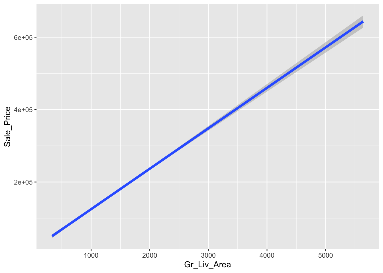
And
ggplot(data = ames) +
  geom_point(mapping = aes(x = Gr_Liv_Area,
                           y = Sale_Price)) +
  geom_smooth(mapping = aes(x = Gr_Liv_Area,
                           y = Sale_Price))
## `geom_smooth()` using method = 'gam' and formula 'y ~ s(x, bs = "cs")'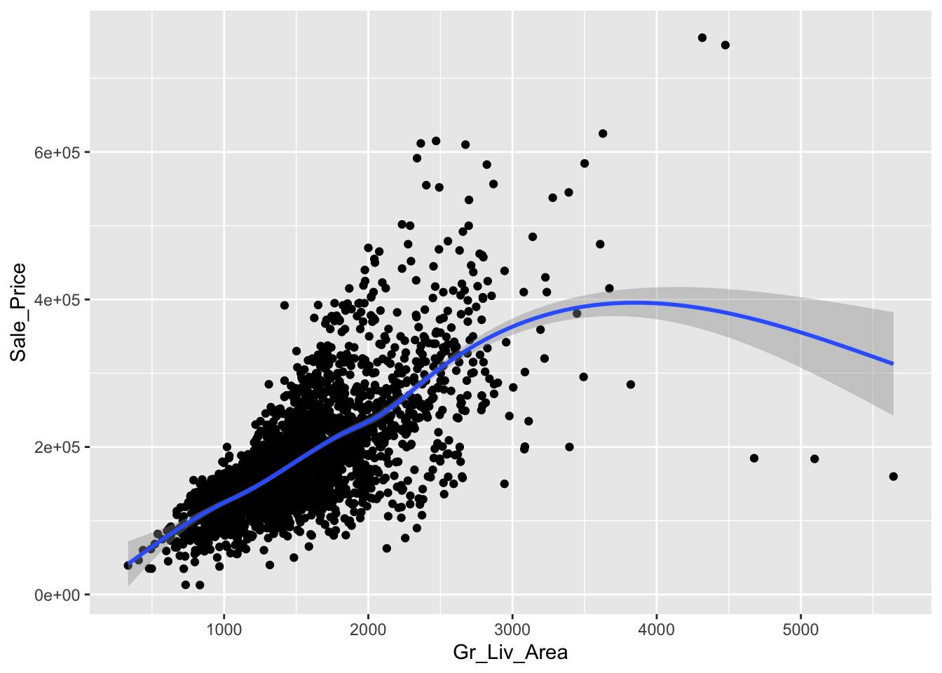
# Or with global mapping

ggplot(data = ames,
       mapping = aes(x = Gr_Liv_Area,
                     y = Sale_Price,
                     color = Central_Air)) +
  geom_point() +
  geom_smooth()
## `geom_smooth()` using method = 'gam' and formula 'y ~ s(x, bs = "cs")'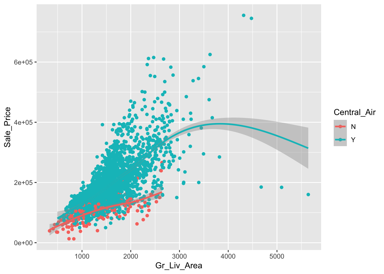
5.3 Interactive graphs
JavaScript is one of the most widely used language to create interactive webpages (html). There is an R package, htmlwidgets, to bind R commands to various interactive JavaScript libraries that provides a great framework for graphs. The interactive components (“widgets”) created using the framework can be used at the R console, seamlessly embedded within R Markdown documents, Shiny web applications, saved as standalone web pages for ad-hoc sharing via email, Dropbox, etc.
There are a number of widgets already available, that you can install and easily make interactive visualizations.
The htmlwidgets, by default, either run locally in your web browser or in the R Studio viewer. If you use R Markdown, the html pages rendered contain the full JavaScript code, so you can also also deploy them to a standard web server (like github pages).
Let’s see one of those widgets, plotly, which binds R commands to o the JavaScript plotly.js graphing library. The plotly package helps translate ggplot2 graphics to an interactive web-based version.
# First install the package, if you haven't yet
library(plotly)

# our previous plot
p <- ggplot2::ggplot(data = ames,
       mapping = aes(x = Gr_Liv_Area,
                     y = Sale_Price,
                     color = Central_Air)) +
  geom_point() +
  geom_smooth()

# Converts ggplot2 to plotly
ggplotly(p)
5.4 Shiny
You can develop a shiny application that accepts user input for your interactive plots. Hence, you can make plots designed by the user. Because it executes an actual R code, shiny requires its own server. There are several ways to share/run an shiny app. Users can use these scripts to launch the app from their own R session.
Let’s have a simple example and see its snapshot. You can run it in a script and see the interactive plot:
library(shiny)
library(ggplot2)
library(dplyr)
library(RBootcamp)


ui <- fluidPage(

  # Give the page a title
  titlePanel("Housing in Ames"),

  # Generate a row with a sidebar
  sidebarLayout(

    # Define the sidebar with one input
    sidebarPanel(
      selectInput("neighborhood", "Neighborhood:",
                  choices=unique(ames$Neighborhood)),
      hr(),
      helpText("Data from Ames Iowa Housing")
    ),

    # Create a spot for the barplot
    mainPanel(
      plotOutput("HousingStylePlot")
    )

  )
)

## Server

# Define a server for the Shiny app
server <- function(input, output) {

  # Fill in the spot we created for a plot
  output$HousingStylePlot <- renderPlot({

    ames %>%
      filter(Neighborhood == input$neighborhood) %>%
      ggplot(aes(x = Gr_Liv_Area,
                     y = Sale_Price,
                     color = Central_Air)) +
      geom_point() +
      geom_smooth()
  })
}

shinyApp(ui, server)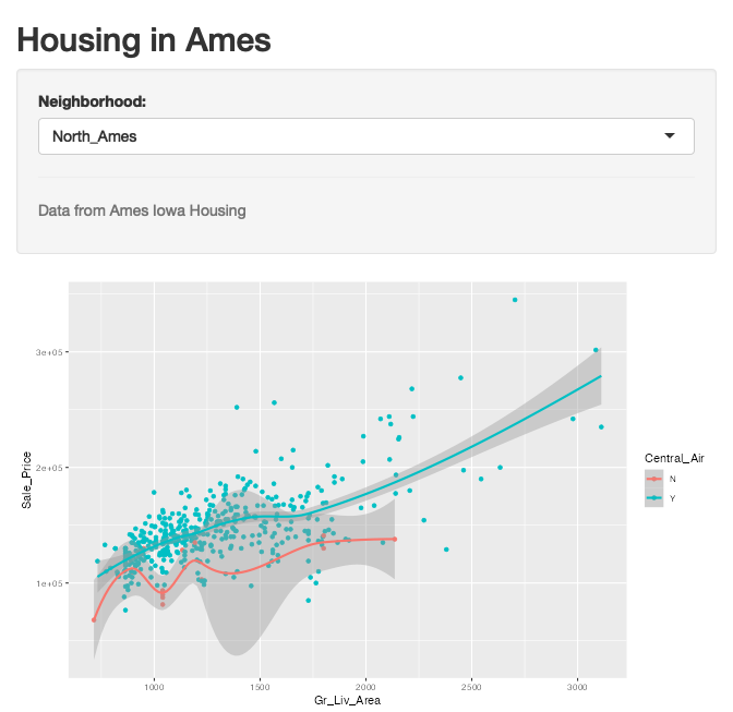
Or you can save it, like app.R, in a folder, like shinyapps, and then you can call it in your console:
# library(shiny)
# runApp("./shinyapp/")
You can share your Shiny app as a web page. This is definitely the most user friendly way to share a Shiny app. You need to host the app so that it can be reached. The easiest option is to host it at shinyapps.io and deploy it in your R Markdown:
knitr::include_app("https://jzmtko-yigit-aydede.shinyapps.io/shinyapp/",
  height = "600px")
The other option is GitHub to host your. You can find the instructions here. More details about hosting your shiny applications can be found here: https://bookdown.org/yihui/rmarkdown/shiny-deploy.html.
5.5 Histograms & Density
How do we visualize continuous variables? One popular plot is called histograms.
hist(ames$Sale_Price)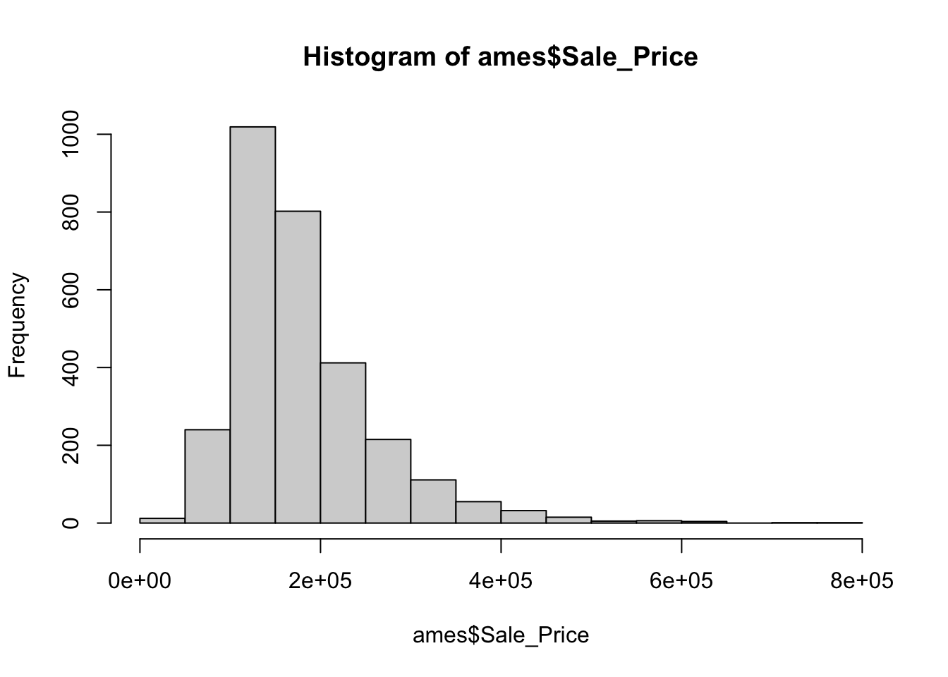
And density with ggplot
ggplot(data = ames, aes(x = Sale_Price)) +
  geom_histogram(aes(y = ..density..)) +
  geom_density(color = "red",
               size = 1.5)
## `stat_bin()` using `bins = 30`. Pick better value with `binwidth`.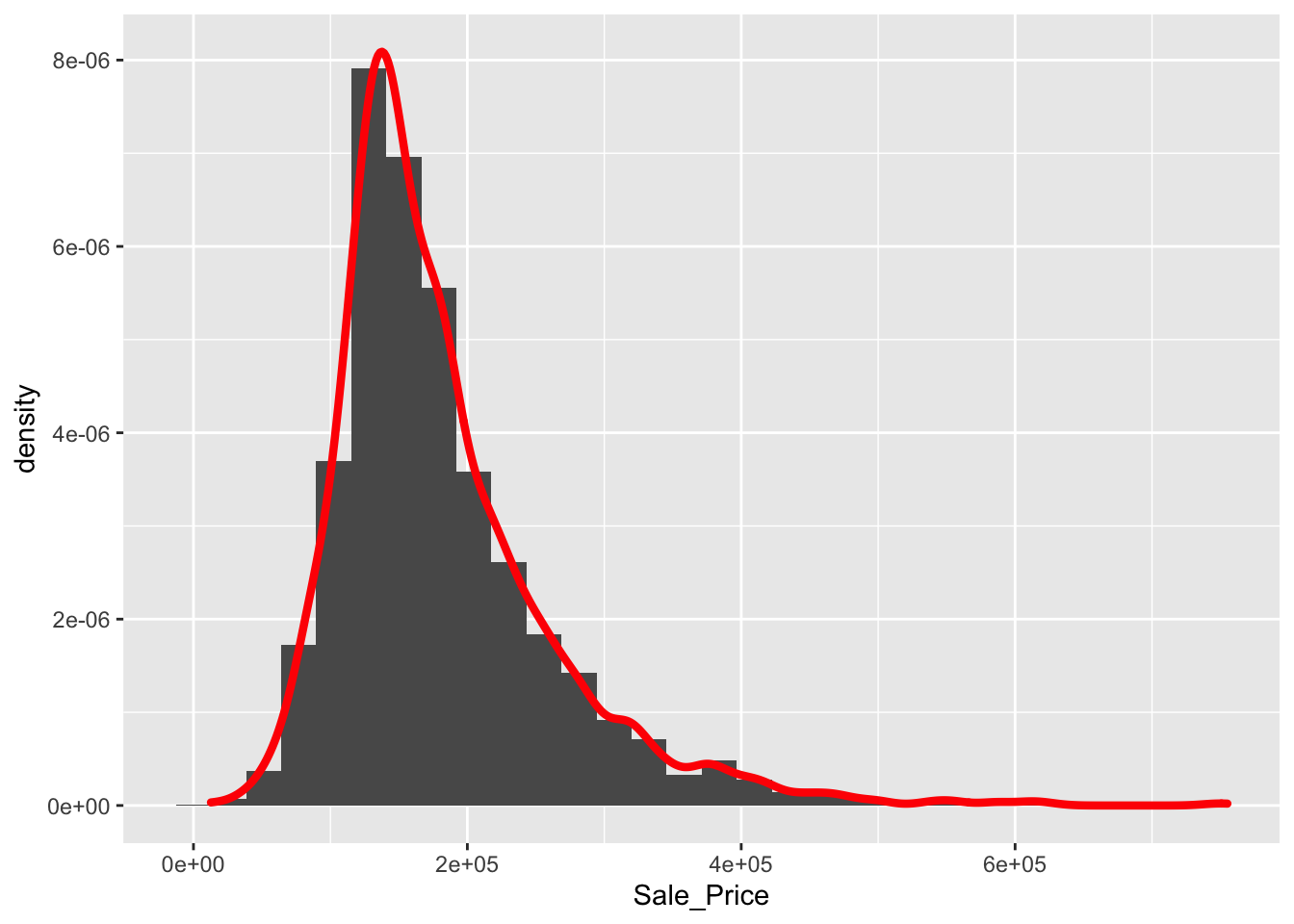
5.6 Multiple plots
fc <- ggplot(data = ames, aes(x = Sale_Price)) +
  geom_histogram(aes(y = ..density..)) +
  geom_density(color = "red",
               size = 1.5)
fc + facet_wrap("Street")
## `stat_bin()` using `bins = 30`. Pick better value with `binwidth`.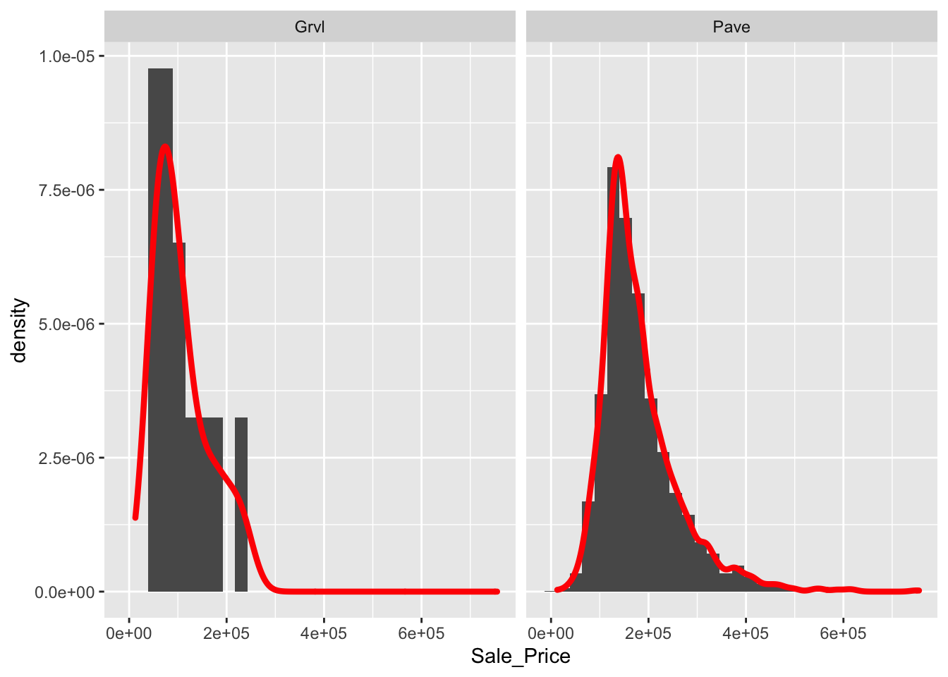
5.7 Labels etc.
fc +
  xlab("Sale Price") +
  ylab("Density") +
  ggtitle("Price vs. Area") +
  theme(axis.text = element_text(size = 25, color = "red")) +
  theme(plot.title = element_text(size = 24,
                                     color = "magenta",
                                     face = "bold",
                                     hjust = 0.5))
## `stat_bin()` using `bins = 30`. Pick better value with `binwidth`.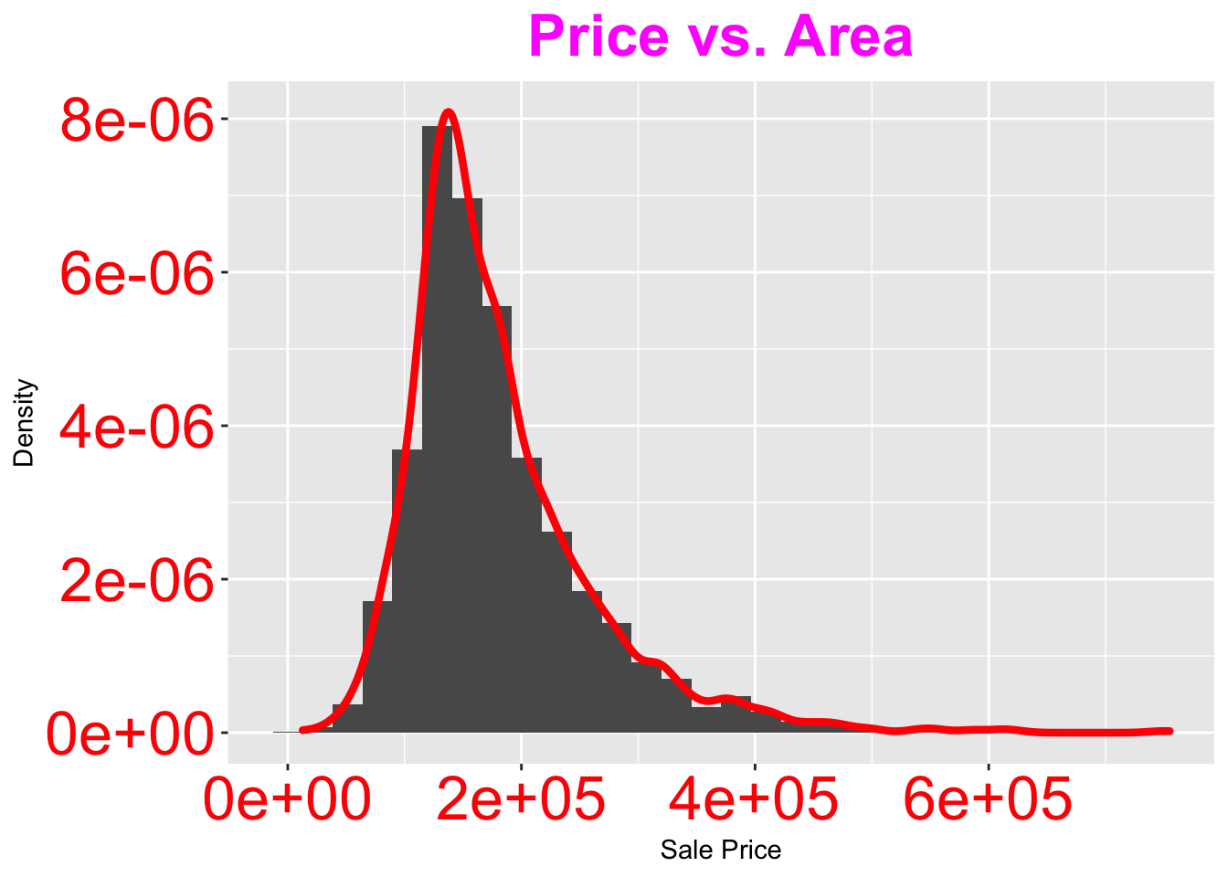
5.8 Add lines
Let’s create some series (compounding series) of $1000:
t <- seq(0, 10, 1/4)
A1 <- 1000*(1+0.05)^t
A2 <- 1000*(1+0.03)^t
A3 <- 1000*(1+0.07)^t
A4 <- 1000*(1+0.1)^tplot(t, A1)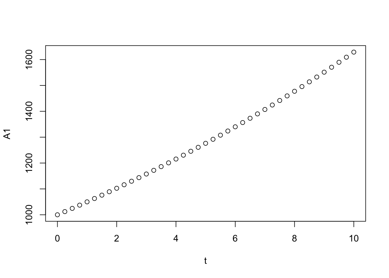
Here is a simple but beautiful plot … So you may not want to use ggplot all the time:
plot(t, A1,  ylim = c(1000,2000),
     type = "l", xlab = "Time (in years)",
     ylab = "Accumulated Value (in $)",
     main = "Accumulated Value of $1000 Investment", col = "black")
lines(t, A2, type = "l", col = "blue", lty = 2, lwd = 2)
lines(t, A3, type = "l", col = "red", lty = 3, lwd = 3)
legend("bottomright",
       legend = c("3% Interest", "5% Interest", "7% Interest"),
       col = c("blue", "black", "red"),
       lty = c(2, 1, 3), bty = "o", cex = 0.75)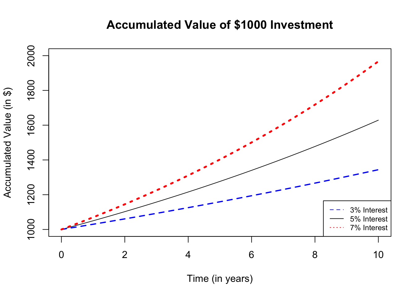
Or we can put them next to each other:
par(mfrow=c(2,2), oma = c(0,0,2,0)) # puts 4 plots in one window (2x2)

plot(t, A1, type = "l", xlab = "Time (in years)",
     ylab = "AV - $", ylim = c(1000, 2500),
     main = "(i = 0.05)")

plot(t, A2, type = "l", xlab = "Time (in years)",
     ylab = "AV - $", ylim = c(1000, 2500),
     main = "(i = 0.03)")

plot(t, A3, type = "l", xlab = "Time (in years)",
     ylab = "AV - $", ylim = c(1000, 2500),
     main = "(i = 0.07)")

plot(t, A4, type = "l", xlab = "Time (in years)",
     ylab = "AV - $", ylim = c(1000, 2500),
     main = "(i = 0.1)")

mtext("Accumulated Value of $1000 Investment",
      outer=TRUE, cex = 1.5, col="olivedrab")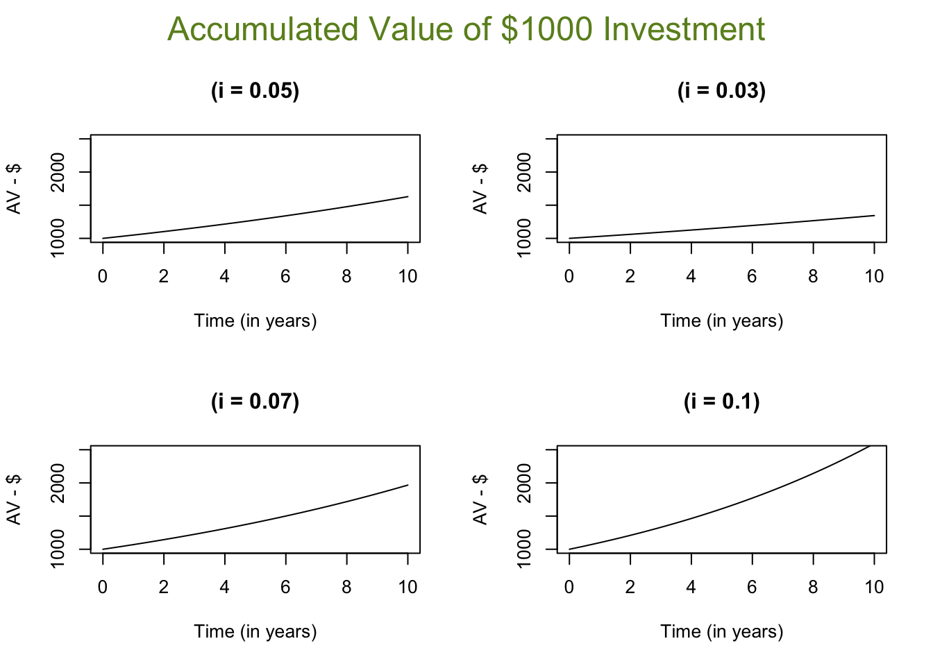
5.9 Pairwise relationship
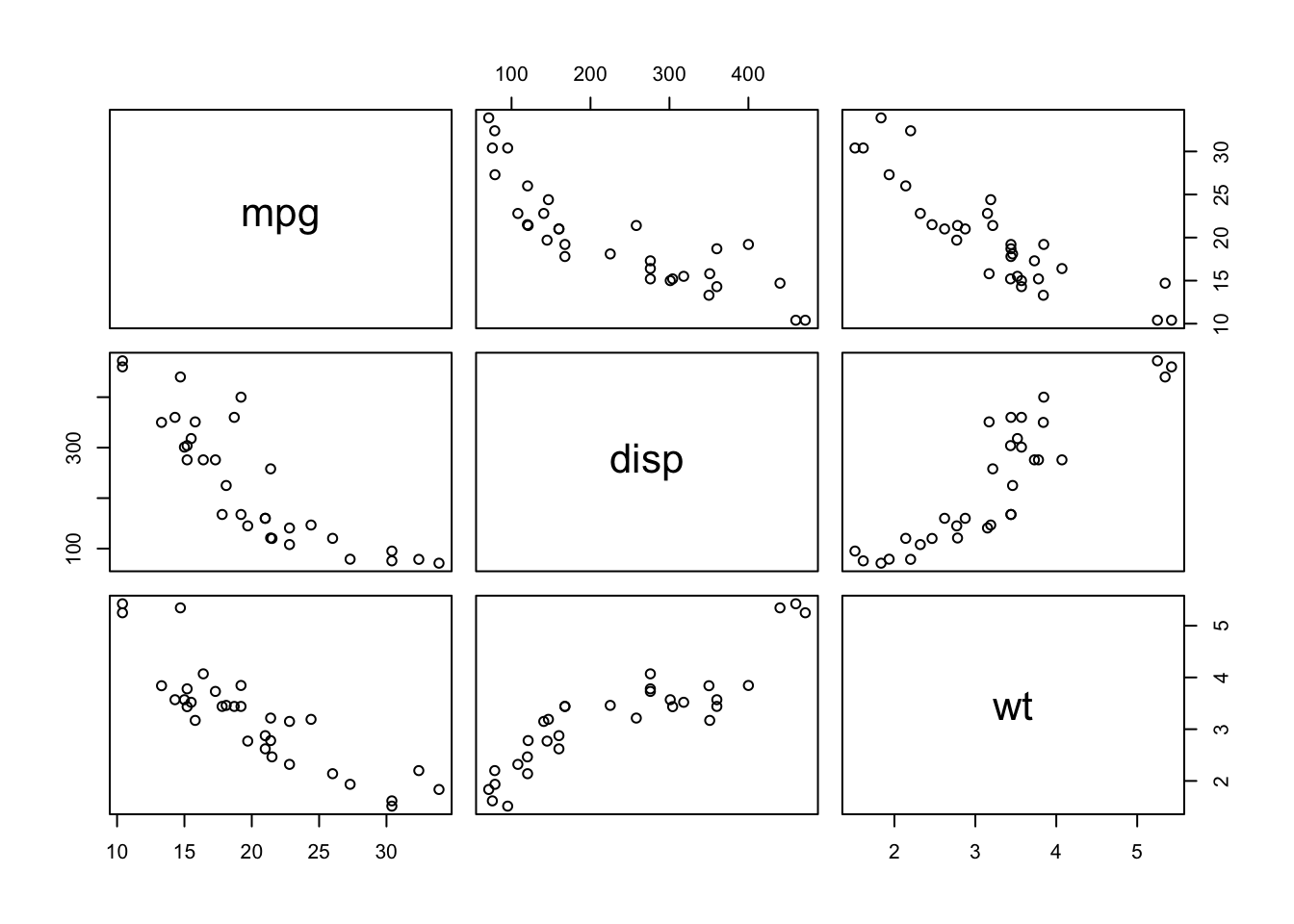
R package corrplot provides a visual exploratory tool on correlation matrix that supports automatic variable reordering to help detect hidden patterns among variables. See more details here
library(corrplot)## corrplot 0.92 loadedM = cor(mtcars)
corrplot(M, method = 'number') # colorful number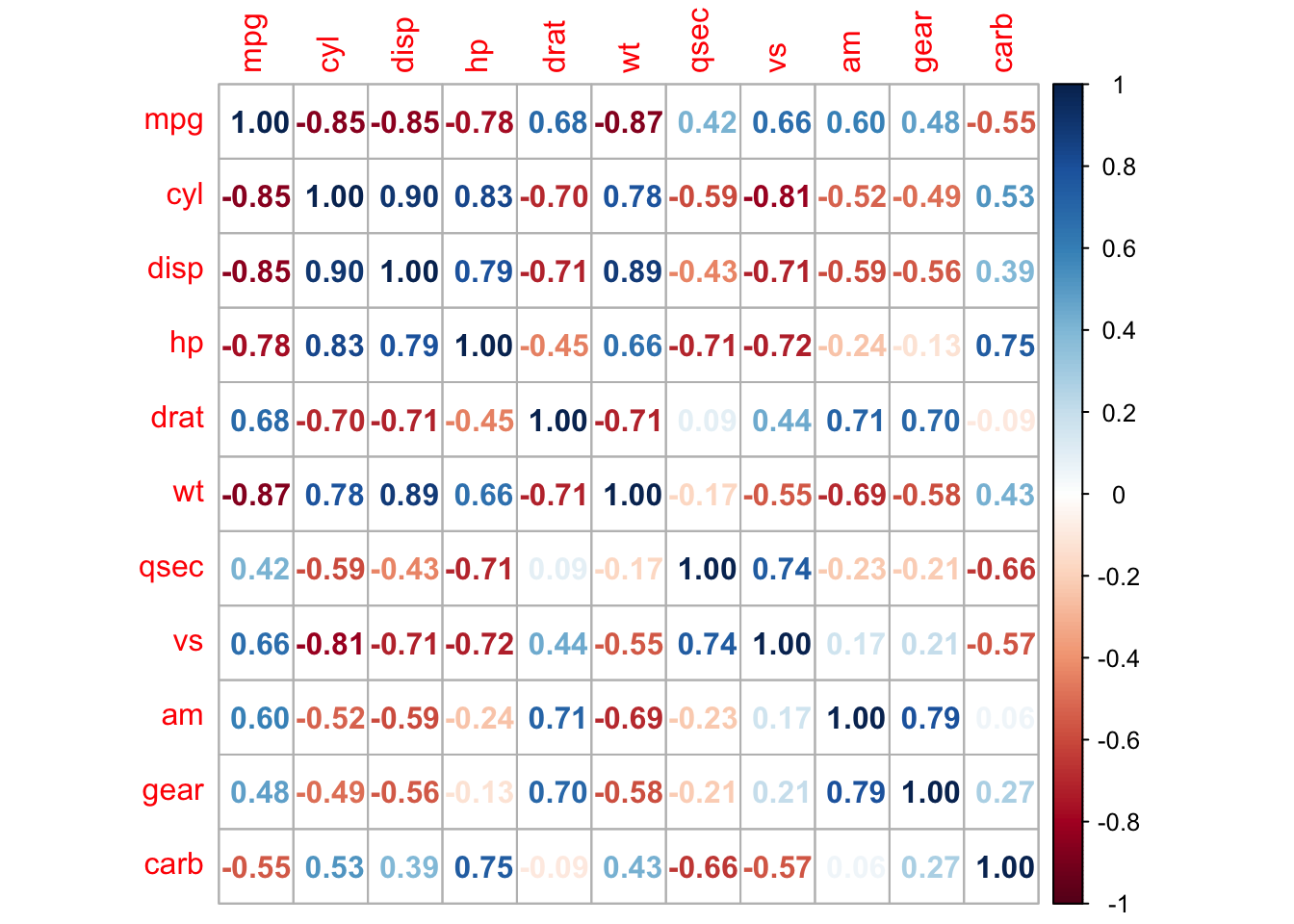
corrplot(M)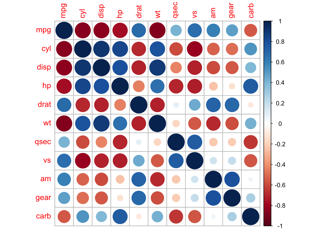
corrplot(M, order = 'AOE')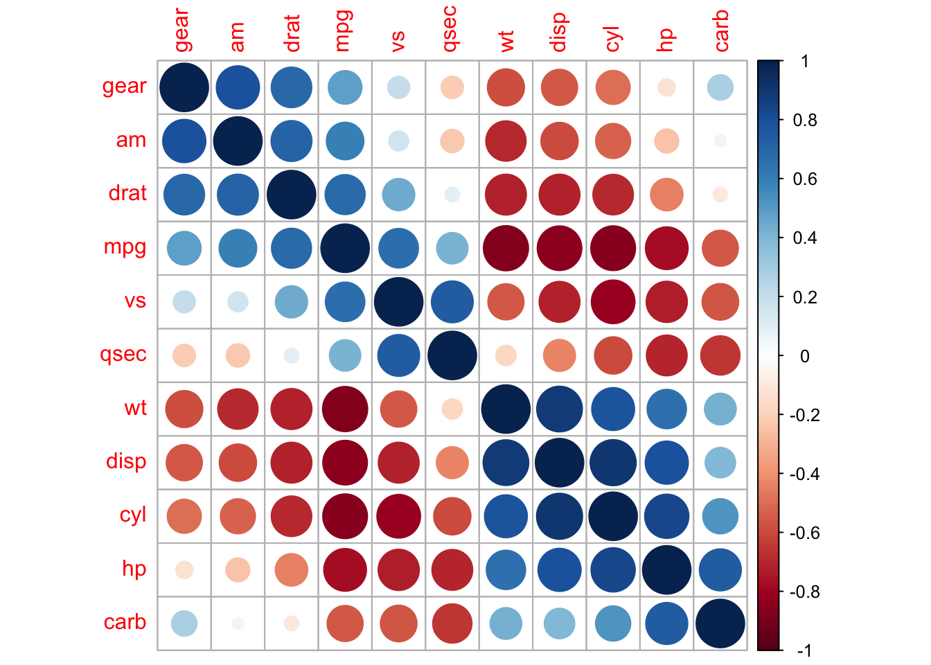
corrplot.mixed(M, order = 'AOE')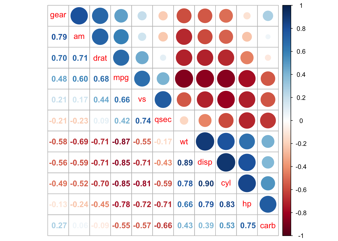
5.10 Conditional Scatterplot
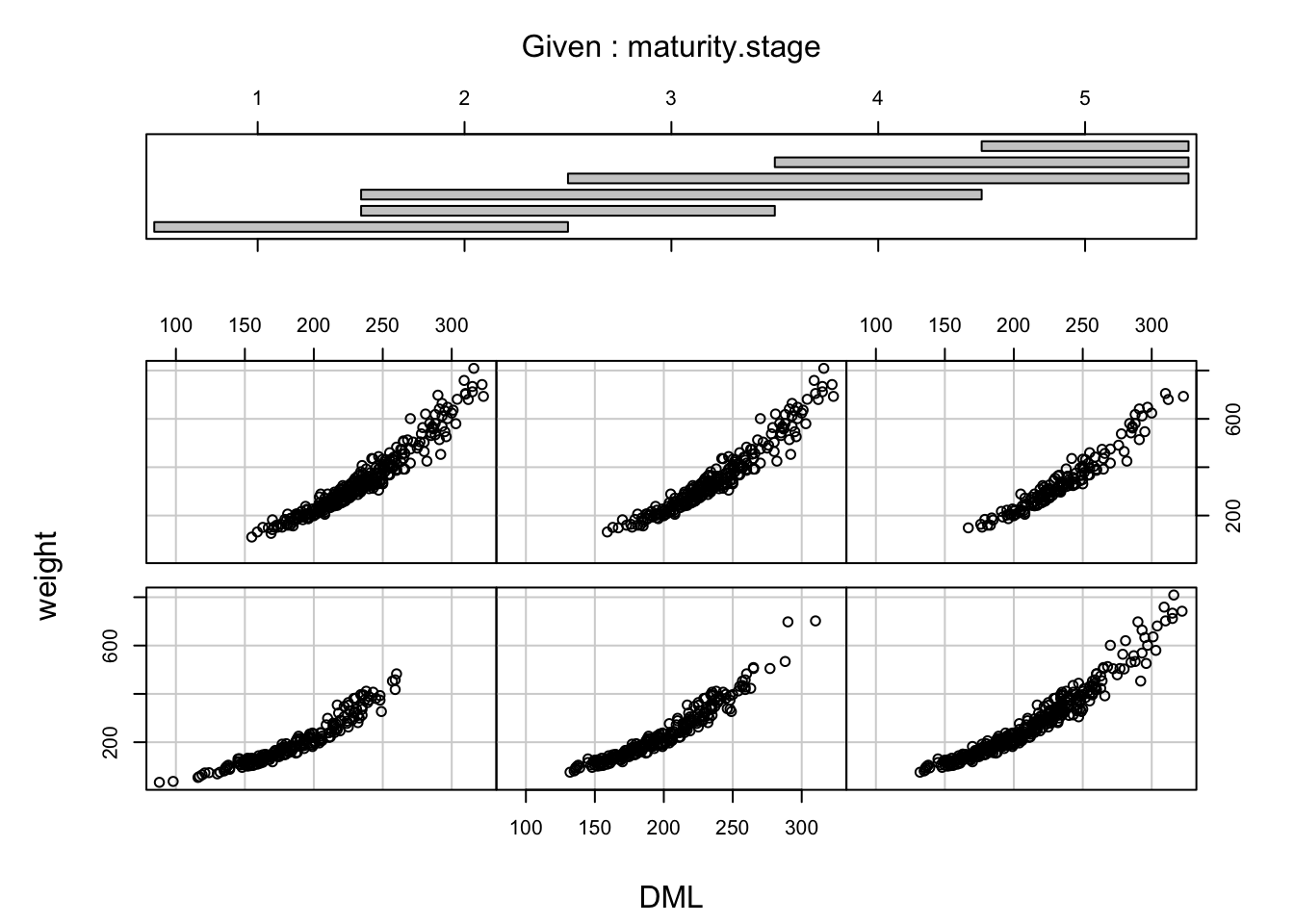
To visualize the relationship between two continuous variables but for different levels of a factor variable you can create a conditional scatterplot with coplot(). Note that we haven’t converted maturity.stage to a factor variable.
library(RBootcamp)
coplot(weight ~ DML | maturity.stage, data = squid1)